Exploratory Data Analysis
In the previous article, we understood the basics of machine learning and its different types, with a special emphasis on supervised learning (thereby the article’s name, supervised learning). Now we take it to the next step, by diving deep into data analysis.
As soon as you have your data, the first thing you need to do is get your hands dirty. Supervised machine learning involves application of models (classifiers and regressors) on data sets, and in order to choose the right model, a better understanding of the data is required. That is what exploratory data analysis or EDA is all about. EDA aims at gaining insight about the features present in a data set, which includes the approximate distributions that they follow, their statistics (mean, median, quartiles, etc.) as well as the relationship between two or more features, among many other things. A basic idea about EDA can be gained from the following video:
The focus of this tutorial will be on the most important data analysis techniques that are used by data scientists, using python. The first component involves finding out the statistical measures such as mean, median etc. of the various features, also known as numerical EDA. Another component that will be covered is visual EDA, which includes histograms of features and the scatterplots of one feature with respect to the other. Various other techniques such as application of scaling, normalization and mathematical transformations upon the data, which are also commonly used. Mathematical transforms are necessary as one of the implicit assumptions often made in machine learning algorithms (eg. Naive Bayes) is that the the features follow a normal or a log-normal distribution. If the algorithm being used is making this assumption of the features following a distribution, then such a transformation can help improve the performance of that algorithm. Although these things pique the interest of any mathematics enthusiast, for this article our focus will remain on the basics of EDA.
The various packages that we will be using are numpy, pandas, matplotlib, seaborn and scikit-learn. All these packages can be downloaded using pip. In your command line, write the command:
$ pip install scikit-learn numpy pandas matplotlib seabornIf you want to use conda, just replace the keyword pip with conda. We’ll be using the iris dataset, which consists of 4 features: petal length, petal width, sepal length and sepal width, all measured in centimetres. The target variable is the species to which a flower belongs, for which there are three possibilities: Setosa, Virginica and Versicolor. The data set is available in scikit-learn, and can hence be imported.
>>> import numpy as np
>>> import pandas as pd
>>> from sklearn import datasets
>>> import matplotlib.pyplot as plt
>>> import seaborn as sns
>>> sns.set()
Seaborn can be optionally set up in order to make our plots look more attractive. The next step is to load the iris dataset.
>>> iris = datasets.load_iris()The dataset is loaded as a bunch. In layman terms, a bunch has features similar to a dictionary. The various keys of the bunch can be explored as:
>>> print(iris.keys())
dict_keys(['data', 'target', 'target_names', 'DESCR', 'feature_names'])
DESCR contains description of the dataset. Both data and target are provided as numpy arrays. Next, we see the shape of data:
>>> print(iris.data.shape)
(150,4)
This shows that the data has 150 rows and 4 columns. Remember that each individual row represents one observation, while each column represents a feature. Also, the target variable is included as 0 for Sentosa, 1 for Versicolor and 2 for Virginica. This can be seen as follows:
>>> print(iris.target_names)
['setosa','versicolor','virginica']
Their indices in the list correspond to their values. In order to perform EDA, we assign variables X and y to data and target respectively and create a pandas dataframe.
>>> X = iris.data
>>> y = iris.target
>>> df = pd.DataFrame(X, columns=iris.feature_names)
Next we take a look at the head of the dataframe.
>>> df.head()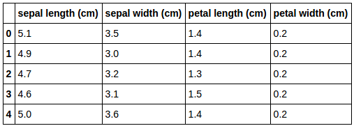
First five rows of iris dataset
This shows us the first five rows of the dataset. Next, we use the describe function of the dataframe to get information about the features.
>>> df.describe()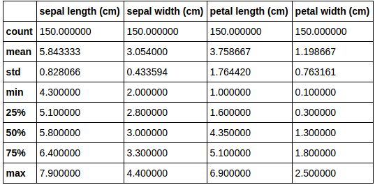
Statistics of features of iris dataset
The describe function gives us the total no. of instances in a column (count), mean, standard deviation, etc. for all the features. For visual EDA, we use the pandas function scatter_matrix:
>>> % matplotlib inline
>>> pd.scatter_matrix(df,c = y,figsize=[8,8],s=150,marker='D')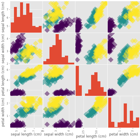
Scatter matrix of all iris features
We pass the scatter_matrix function our dataframe, given as df, and pass our target variable y as argument to the parameter c, which represents color, so that flowers of different species are colored differently on the scatterplots. We assign to marker the value ‘D’, so that each data point is represented as a diamond and the parameter s represents its shape. The parameter figsize is used to define the size of the scatter matrix.
The %matplotlib inline command is used to display the plot without using the plt.show() command. In the scatter matrix, there are histograms of individual features across the diagonal, while scatterplots of feature combinations are present everywhere else. The scatter matrix helps us analyze the individual features as well as their combinations via a single figure. For example, the petal length vs petal width plot shows a strong correlation between the two features (correlation means a mutual relationship or connection between two or more things), which is what we would have intuitively thought, as generally, a flower with a large petal length would also have a large petal width, and vice versa.
Correlation between any two features can be understood with the help of simple scatter plots as well. Using seaborn, scatter plot with a linear fit for petal length and petal width can be plotted as follows:
>>> sns.jointplot(x='petal length (cm)', y='petal width (cm)', data=df, kind='reg')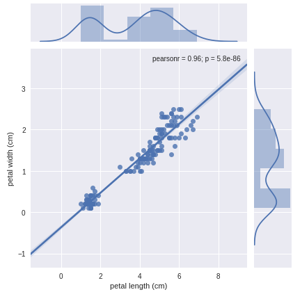
Scatter plot of petal length and petal width
If you don’t want the linear fit, simply change the kind parameter to scatter. The scatter plot also gives us the pearson’s coefficient and the p-value associated with the two features. Apart from histograms, individual features can be analyzed with the help of box plots. In order to understand box plots, you can checkout out its wikipedia page. Box plot can be plotted for petal length using seaborn as follows:
>>> sns.boxplot('petal length (cm)', data=df)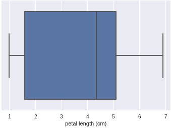
Box plot of petal length
Exploratory data analysis doesn’t end here; it is just the beginning. With a proper intuition about the features present in your data, you’ll be able to perform the future steps, including model fitting and prediction, with clarity. Understanding your data is the most important part of machine learning, and you’ve just done it! For more information, you can refer to the following:
- Datacamp’s tutorial on EDA with python by Karlijn Willems.
- Coursera’s lesson on exploratory data analysis by Lisa Dierker, Wesleyan University.
- Analytics Vidhya’s blog on data science with python from scratch, which covers exploratory data analysis.